|
|
|
Welcome to All Car Logos dot net,
where you will find any car logos in any color. We also have historical car logos and information about car logo that you can find in this website.
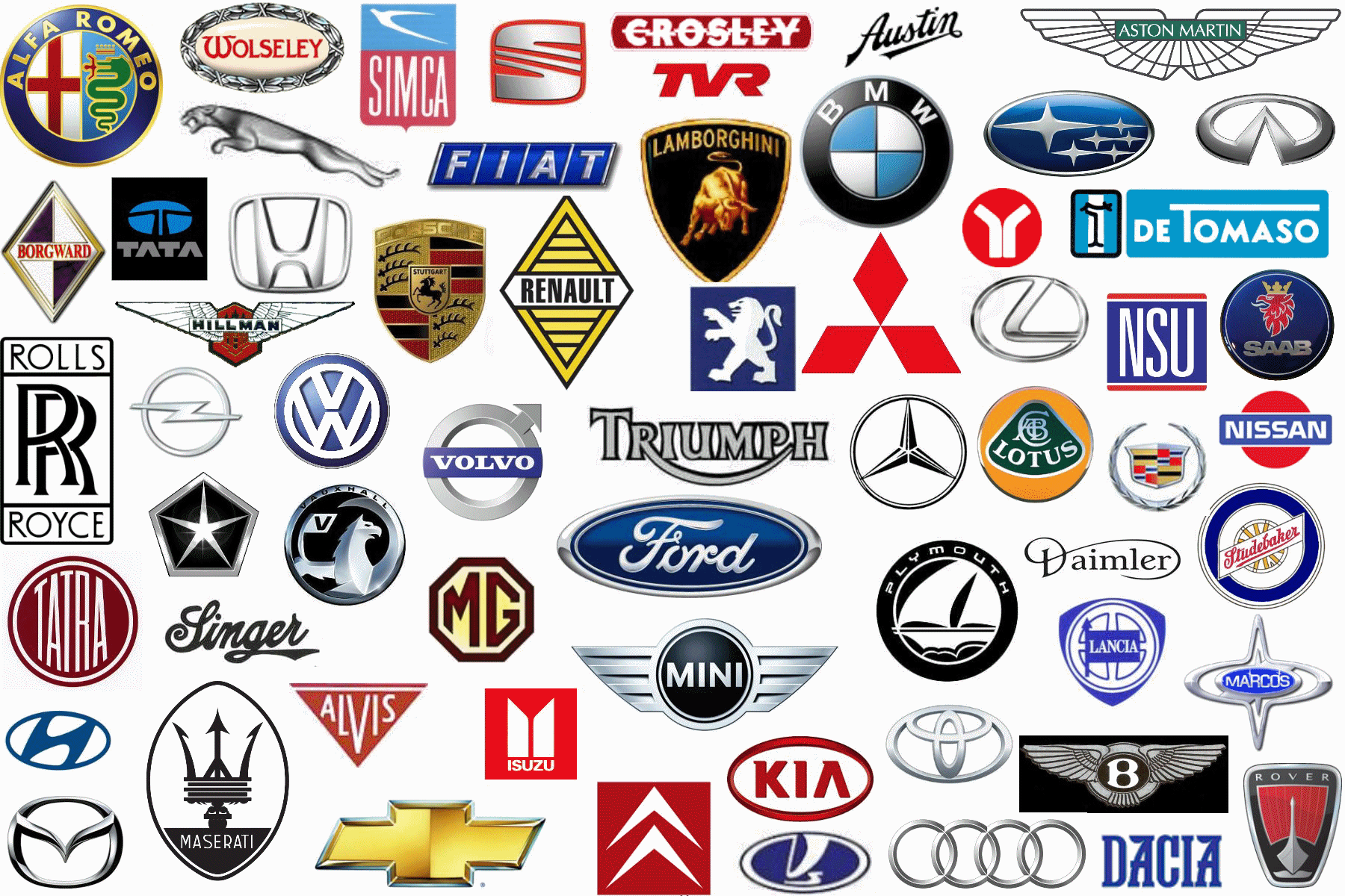
This time we will try to show some symbols that became the symbol of some of the leading automobile companies in the world. Some of these are:
In 1932, four car makers Audi, Horch, DKW, and Wanderer merged to form Auto Union. The logo of Auto Union, four interlinked rings that would later become the modern Audi car logo, was used only in racing cars – the four factories continued to produce cars under their own names and emblems. In 1985 Auto Union ultimately became the Audi as we know today.
The circular BMW car logo was a representation of a spinning propeller of a Bavarian Luftwaffe. At the time, aircrafts were painted with regional colors and the colors of the Bavarian flag were white and blue. It is said that the pilot saw the propeller as alternating segments of white and blue, hence thecar logo. The roundel was a nod to Karl Rapp’s original company.
The Honda car logo was first used in 1963 on the then newly produced Mini-Transporter T360. Since then, there have been minor modifications to the logo, but in most cases just the line width of the “H” was adjusted. Since 1966, there’s a separate logo for the European countries: The “H” is a little bigger than in Japan.
Mazda’s current car logo, nicknamed the “owl” logo, was designed by Rei Yoshimara in 1997. The stylized “M” was meant to look like stretched wings, but many people saw a stylized tulip instead.
Mercedez Benz is combination of two car companies, namely, Daimler-Motored-Gesellschaft and Benz & Cie. The star in Daimler’s logo came from an old postcard where Gottlieb Daimler had drawn a star above the picture of his house and wrote that “this star would one day shine over [his] own factory to symbolize prosperity.” The three-pointed star symbolized Daimler’s ambition of making vehicles “on land, on water and in the air.” After the merger, a new car logo was designed. It combined the symbols of the two companies: the three-pointed star of DMG and the laurel wreath of Benz. In modern days, the laurel wreat is no longer used for the Mercedez Benz cars.
The Mitsubishi car logo was a combination of the Iwasaki family crest, three stacked diamonds, and the three-leaf crest of the Tosa Clan. The name Mitsubishi was a combination of the words “mitsu” (three) and “hishi” (water chestnut, used in Japan to mean a rhombus or a diamond shape). The official translation of the name was “three diamonds.”
Toyota introduced a new worldwide logo in October 1989 to commemorate the 50th year of the company, and to differentiate it from the newly released luxury Lexus brand. The logo made its debut on the 1989 Toyota Celsior and quickly gained worldwide recognition. There are three ovals in the new logo that combine to form the letter “T”, which stands for Toyota. The overlapping of the two perpendicular ovals inside the larger oval represent the mutually beneficial relationship and trust that is placed between the customer and the company while the larger oval that surrounds both of these inner ovals represent the “global expansion of Toyota’s technology and unlimited potential for the future.” The car logo started appearing on all printed material, advertisements, dealer signage, and the vehicles themselves in 1990.
The VW car logo was supposedly designed by Franz Xavier Reimspiess, an employee of Porsche, during an office logo design competition. He was given a one time payment of 100 Reichsmarks (about $400).
The Volvo car logo is an ancient chemistry sign for iron, which is used to symbolize the strength of iron used in the car, because Sweden is known for its quality iron. The diagonal line (a strip of metal) across the grille came about to hold the actual symbol, a circle with an arrow, in front of the radiator.

